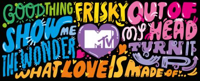
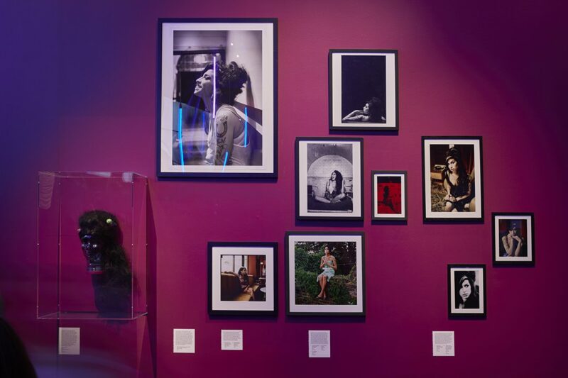
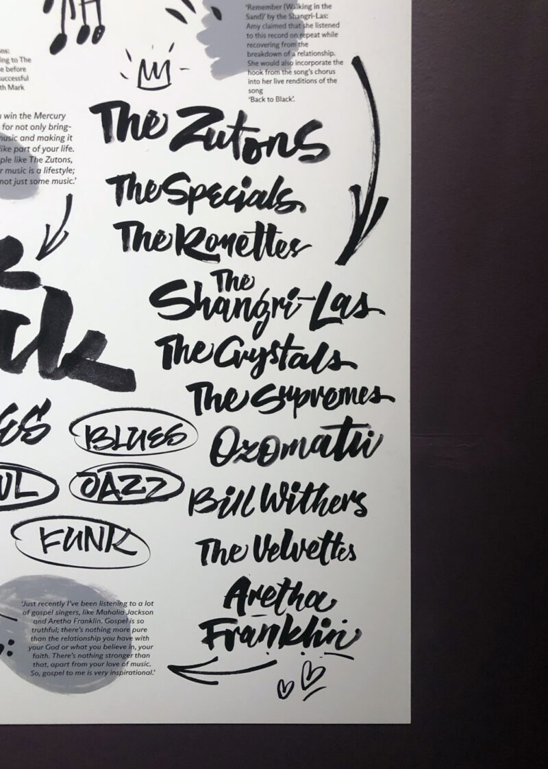
Amy was known for her deep, expressive contralto vocals and her eclectic mix of musical genres, including soul, rhythm, blues, and jazz. She was a passionate, vulnerable and brave soul, who through her writing and musical expression brought raw feelings to the public that connected with people and shaped an era in music history. Our initial instincts for the approach for the 2D design was to ensure we created something personable yet complex, combining multiple references to match Amy’s eclectic taste. Visitors can feel like they’ve had a closer connection with the artist and had insight into her character.
The handwritten lyric sheets and notebook pages that were a major part of the exhibition resonated strongly with us. These connect directly to Amy, her creative process, penmanship and her music. The lyric pages are glimpses into a moment in time and what we like most about these is that they are just one page; we don’t see what was on the page before, or what was on the page after.
The act of writing is the most personal and pure process of forming feelings into a tangible, visible matter. Journals helped Amy learn more about herself as a writer and person. How can we make the captions themselves feel like moments of Amy’s legacy? We don’t want them to feel cold or disconnected from the exhibits, but they must also address practical issues regarding exhibition needs and accessibility.
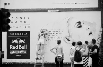
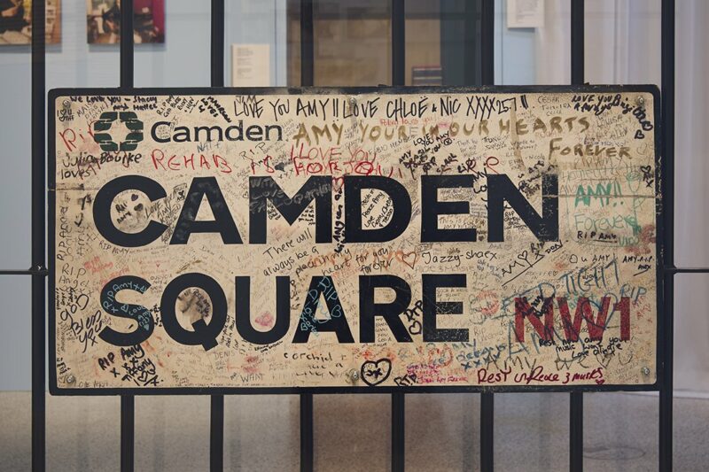
Camden itself – a haven of counter-culture, fashion, craft, history, and music. This particular part of London was home to Amy, and it is the area her fans from all over the world associate her legacy. It’s easy to notice when walking along the streets of Camden, that it’s here the magic happens and all those contrary aesthetics merge seamlessly – creating a beautiful, vibrant and eclectic source of inspiration.
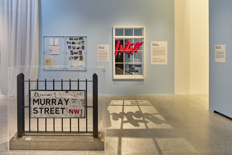
The CAMDEN SQUARE sign which has been covered in tributes also served as inspiration for the captions and typography.
INTRO PANELS
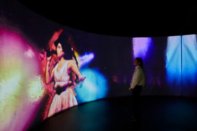
Amy Winehouse’s iconic and eclectic style was born from the remix of all of her influences. The panels are in form of physical assemblage, remixing key influences and backdrops from her career. Referencing materials and iconography from many of the key exhibits.
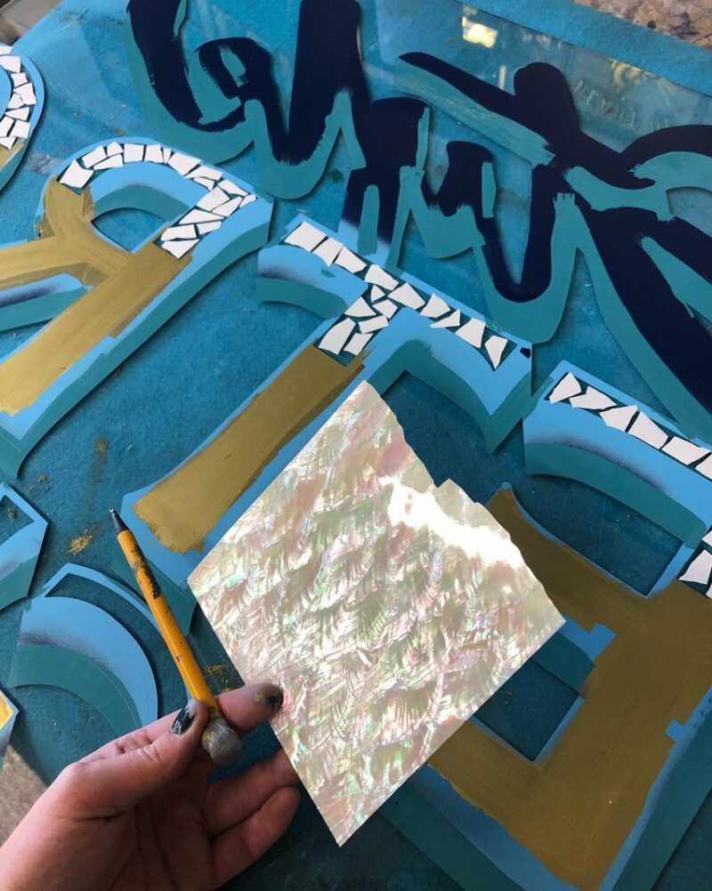
We were keen to use materials that have a warmth and connection to the exhibits and spaces that Amy performed. Lean into tactile, personalised materials: aged wood, glass, paint applied manually, paper, and textiles and stay away from automatised, industrial processes and cold materials such as metal, stone or plastic.
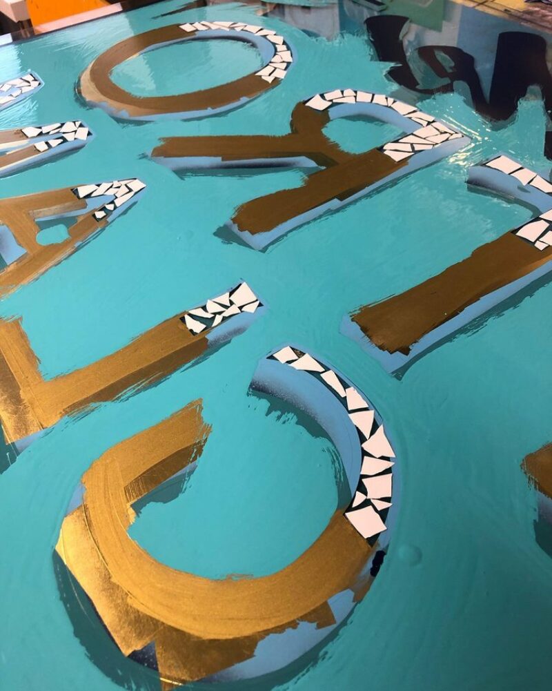
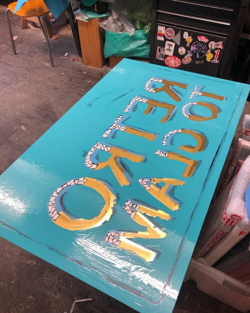
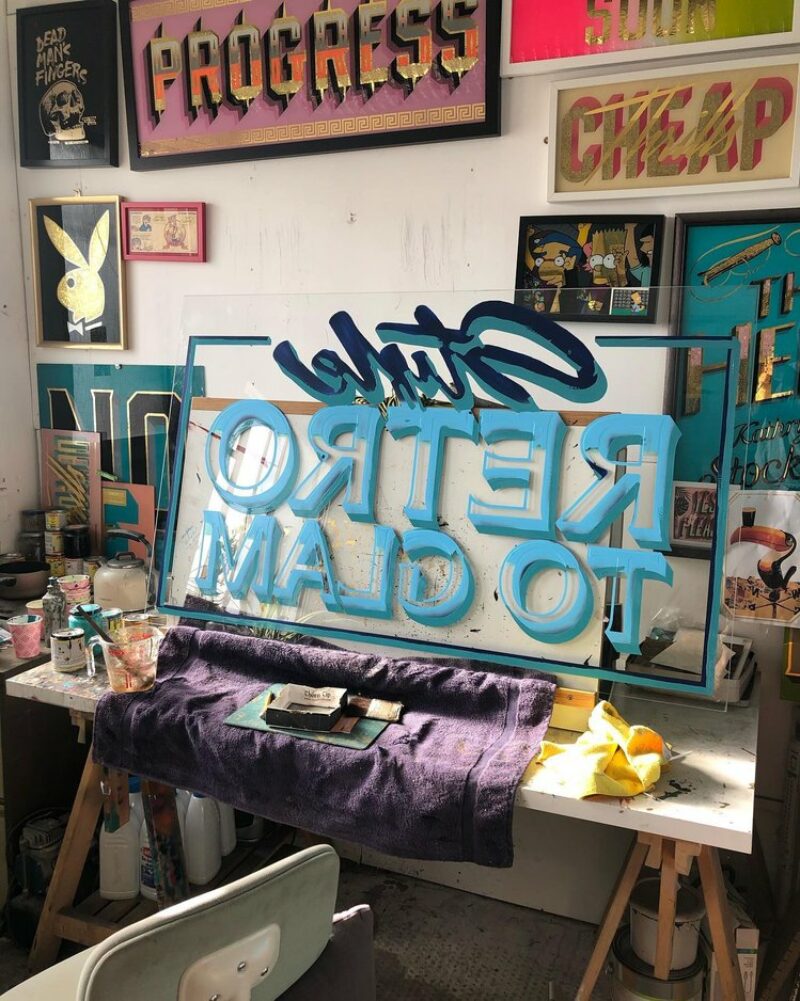
We designed 4 panels for gallery sections. The objects were executed with mixed media and various materials, various traditional sign painting techniques, and gold foil by Alex May Hughes.
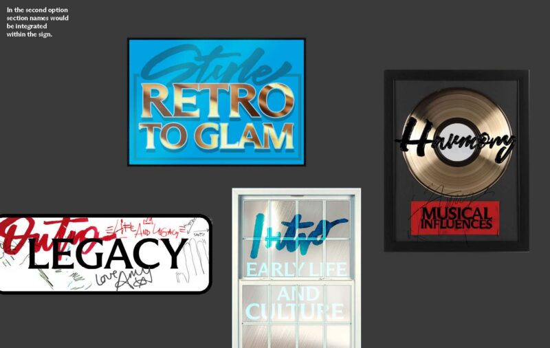
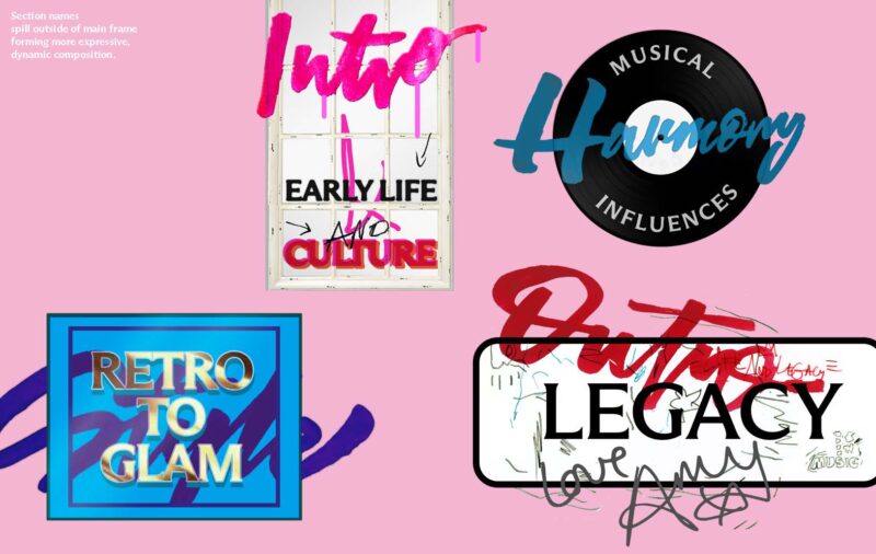
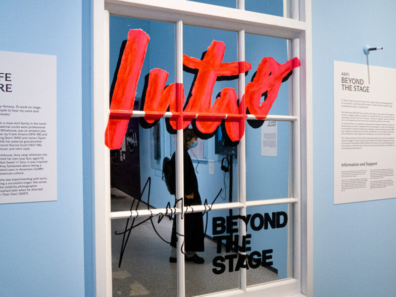
INTRO: Early Life and Ambitions
Reclaimed window with hand painted lettering
Referencing Amy’s early life, looking for her voice as an artist, home in Camden.
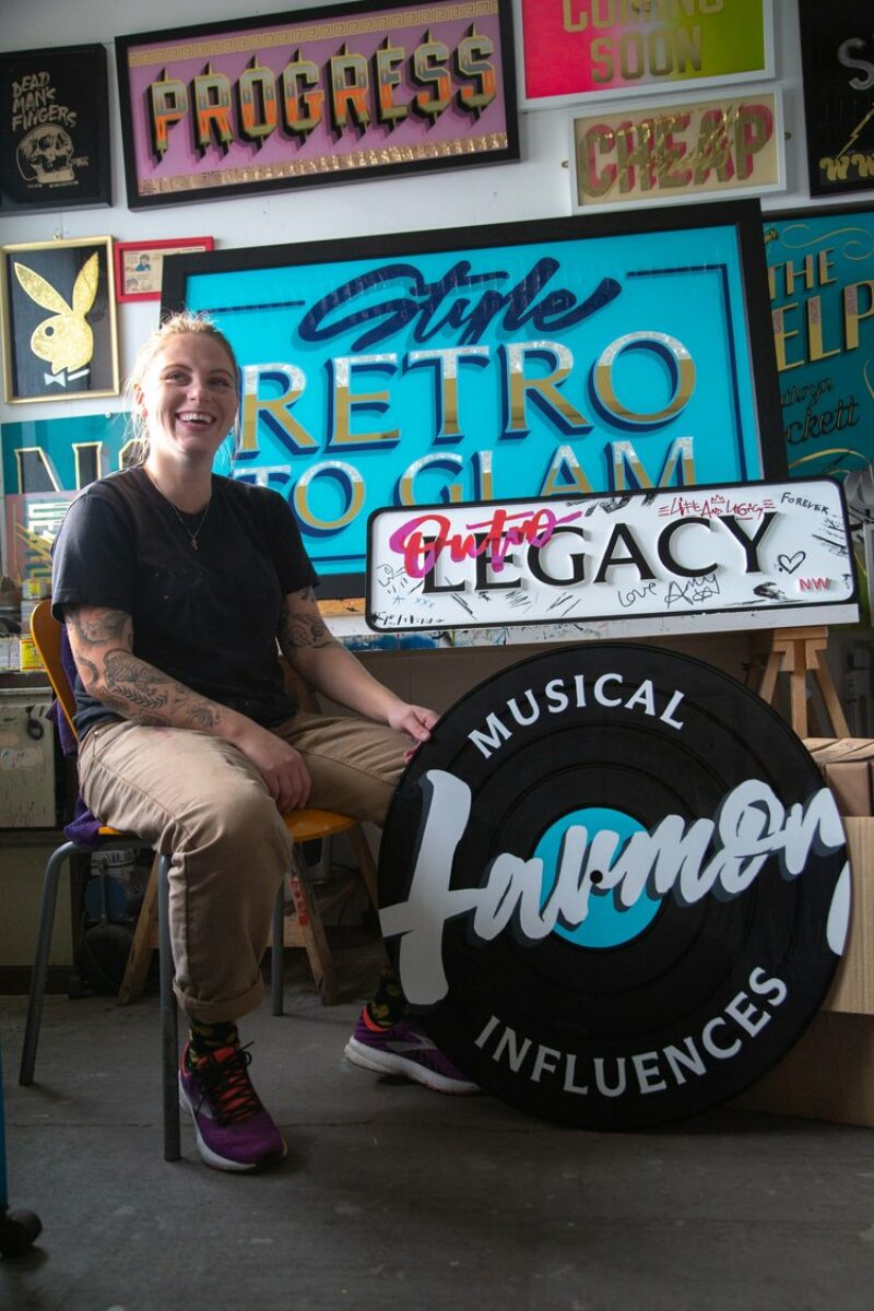
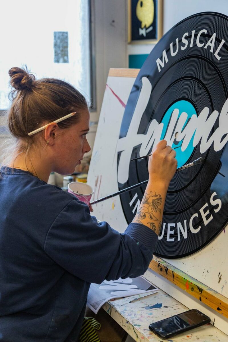
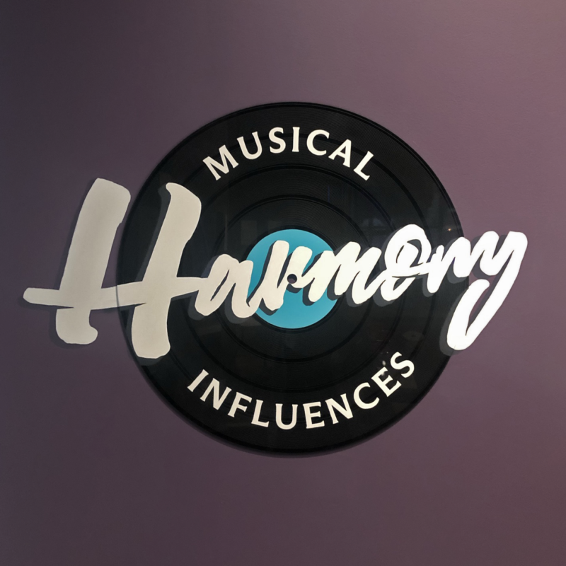
HARMONY: Musical Influences
Black vinyl plate – referencing recording studio and music.
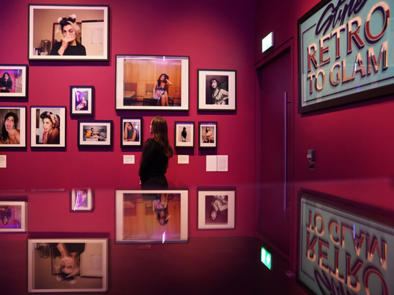
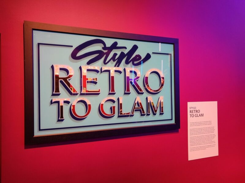
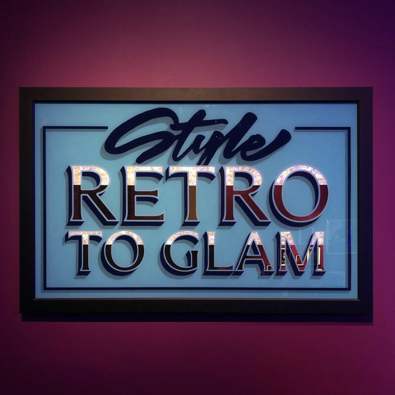
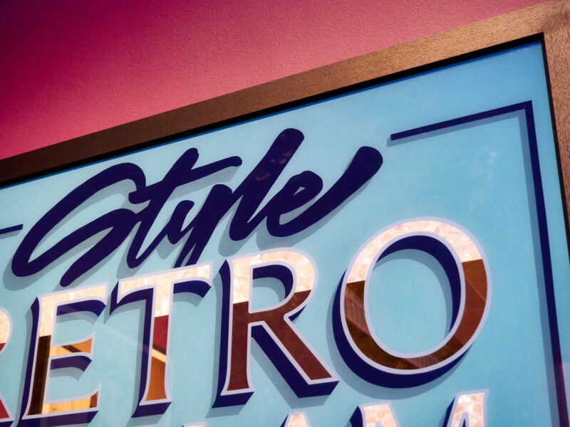
STYLE: Retro to Glam
Traditional hand painted, gold gilded sign referencing to Camden pubs and venues where she started her career.
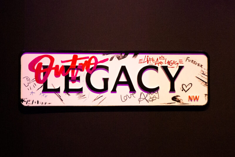
OUTRO: Legacy
Metal embossed plaque with painted notes – referring to the famous Camden Square sign covered with scribbles of Amy’s fans.
Translating this multi-faceted mashup of styles into a coherent design system was quite challenging. We focused on a simplified colour palette and emphasize the bare beauty of writing. The collection of variable, imperfect hand lettering combined with London-inspired typeface represents her vulnerable and sincere personality and positioned in the real place.
Typography and Captions
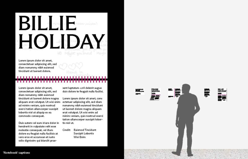
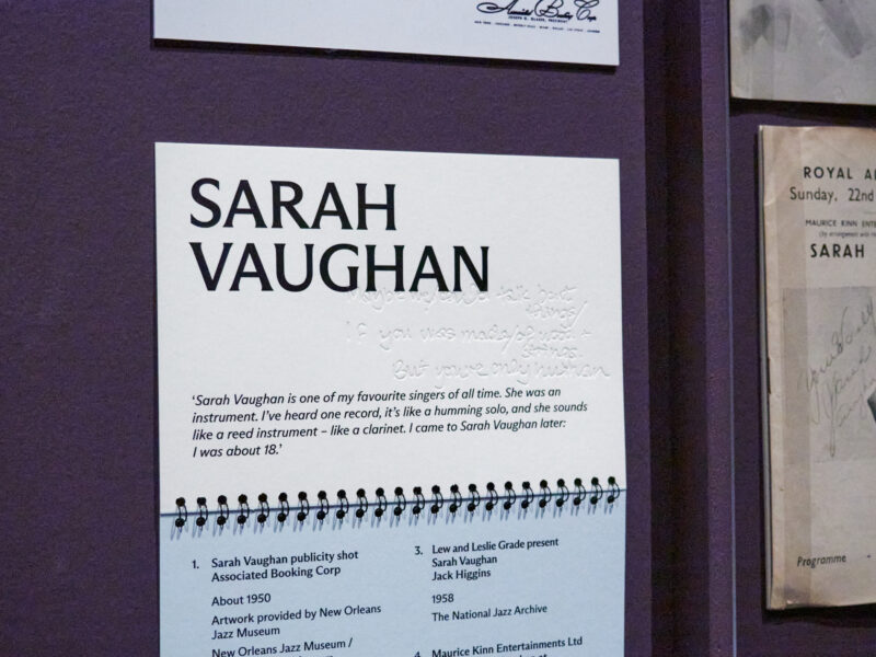
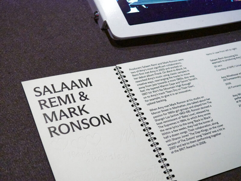
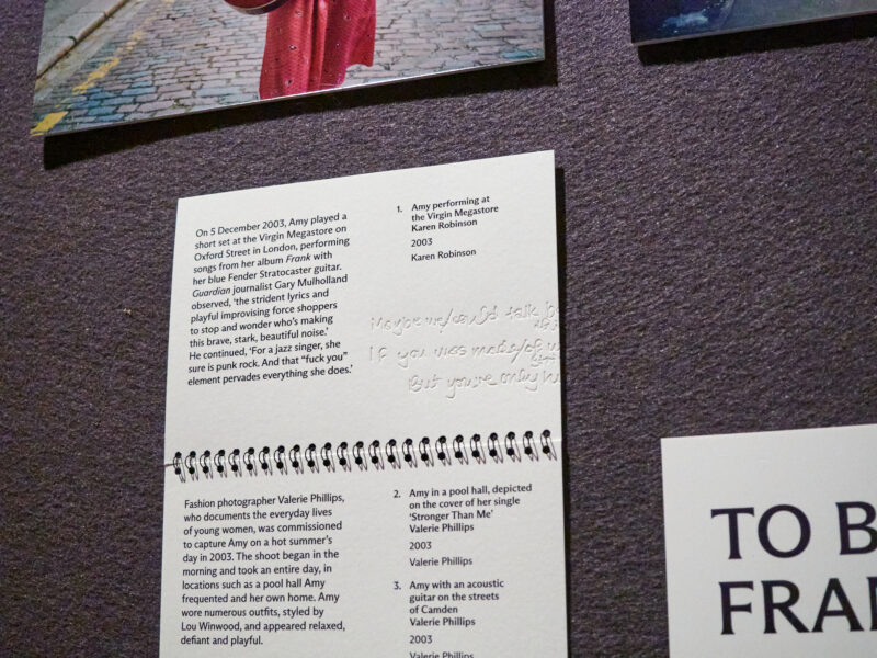
We build a system, exploring the form of a notebook. Spiral bindings in notebooks can adapt to different placements in the space. They can create interesting shapes and angles when positioned on flat or horizontal surfaces.
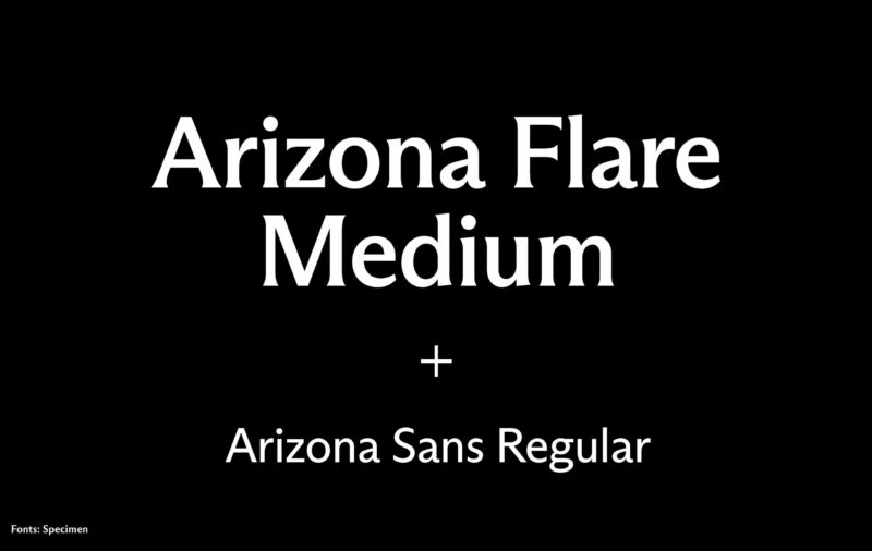
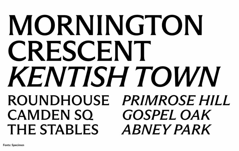
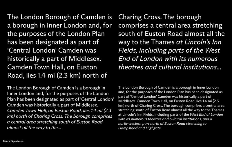
For the ident typeface, we wanted to use something that felt British and linked to London and to Camden. Arizona Flare by Dinamo Foundry is a contemporary serif typeface with a nod to the classic use of Albertus seen on London road signs. Combined with Arizona Sans, from the same type family, for body copy, which shares similar construction but with a clarity and sharpness that pairs very nicely with the flared styles of the headings. The body copy does not pull any distracting moves, focusing on section titles and the exhibits.
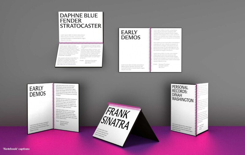
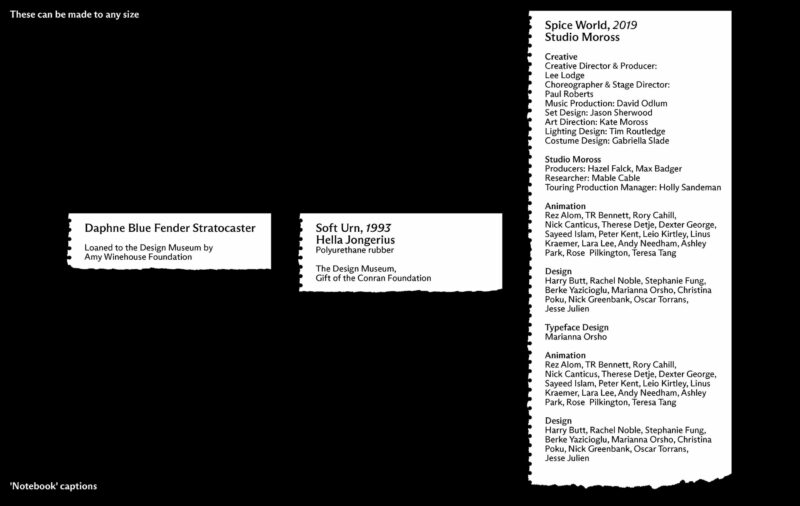
We had the idea to deboss a section of Amy’s handwriting into the open page of the notebooks. Through the use of embossing, Absent yet physical evidence of Amy’s life and arranges it around the nebulous, conceptual parts of her imagination and experience. The lack of ink manifests an absence whilst the permanent change of the paper surface signifies the artist’s impact on people, music and culture.
Credits
Creative Direction
Aries Moross
Art Direction
Anna Czuż
Design
Johnny Brennan
Anna Czuż
Nick Greenbank
Aries Moross
Wale Osunla
Project Management
Bex Dowse
Ellen Morrison