Beginning in August 2018, MASSIVE launched to champion British cinema to 16-24 year olds all across the UK, giving young people the chance to experience the best British films together and in the cinema.
Delivered by the crowdsourced cinema platform ourscreen & entertainment agency elevenfiftyfive, MASSIVE is a first-of-its-kind project globally.
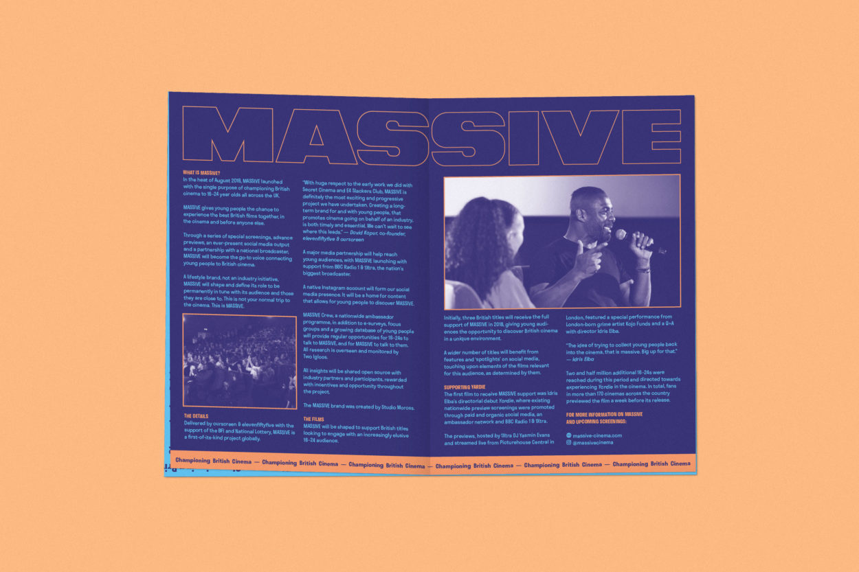
MASSIVE’s identity is built to support British titles looking to engage with an increasingly elusive 16-24 audience. Initially, three British titles will receive the full support of MASSIVE in 2018 and early 2019, giving young audiences the opportunity to discover British cinema in a unique environment.
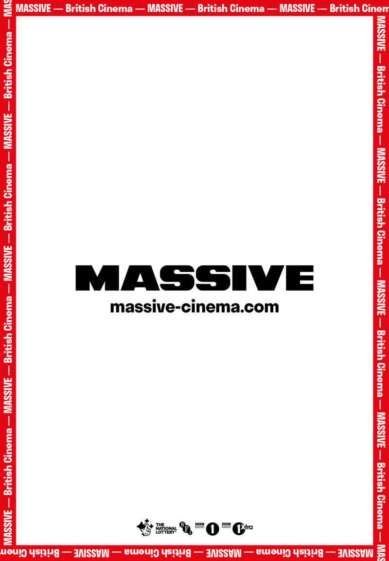
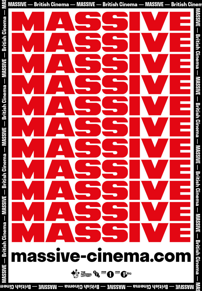
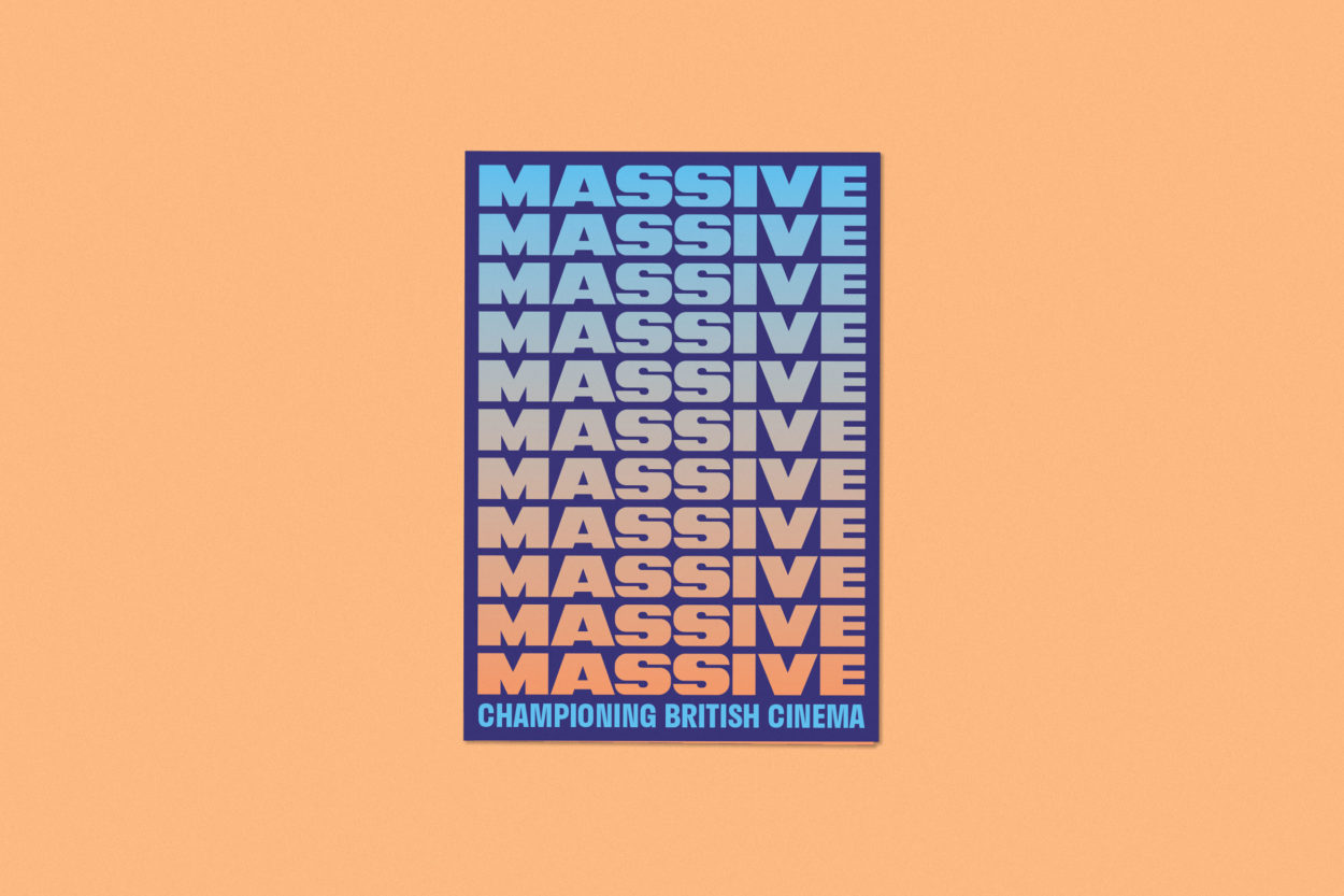
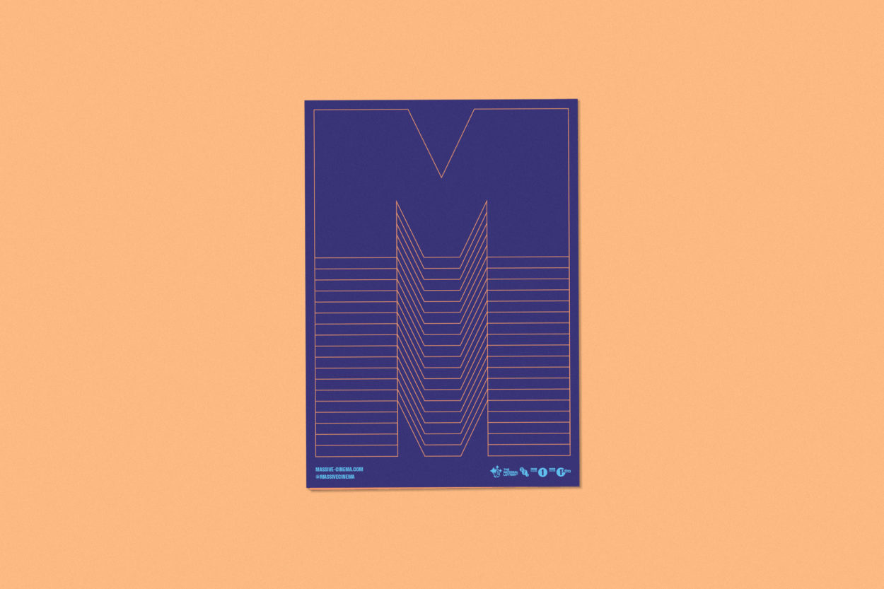
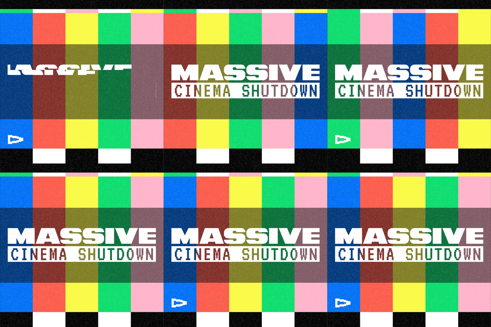
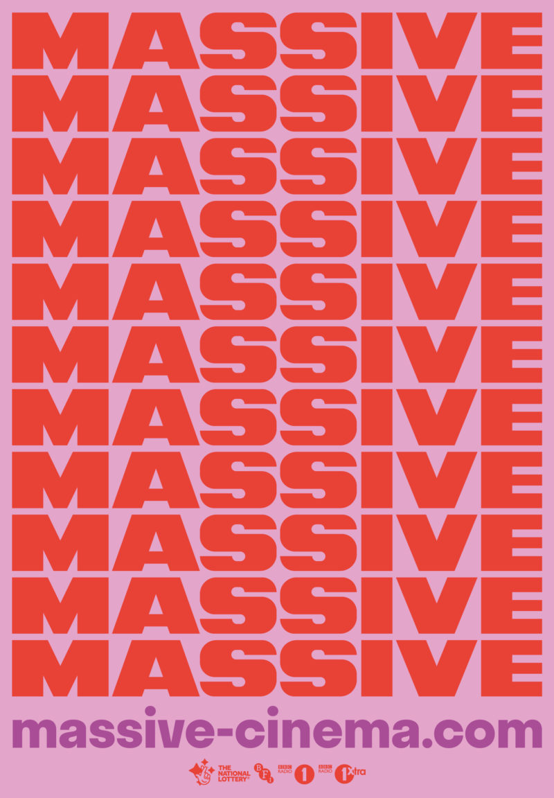
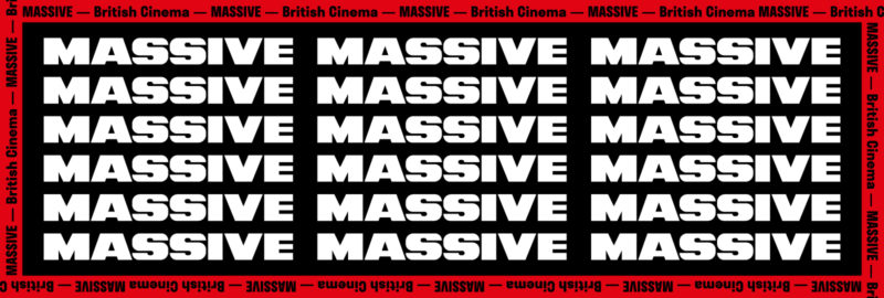
Drawing inspiration from the bold typography seen in magazine mastheads, as well as marquee ticker tapes and banners across movie posters; the logo and overall creative direction are influenced by these elements, which are often seen at and sometimes associated with a visit to the cinema. The contrasting bright and dark colours used throughout the Massive identity are also inspired the visual language of magazine covers, movie posters and trips to the cinema.
Nick, a designer at Studio Moross, said: “The logo itself is a redraw based on the typeface Information Extra Bold Wide, designed in the late 50s by Friedrich K. Sallwey and does not exist digitally. The type was chosen for the interesting character details and it’s weight and width, which was appropriate since we were looking at magazine mastheads and whilst researching the typeface we also found that it had been used in a small number of movies for opening title sequences.
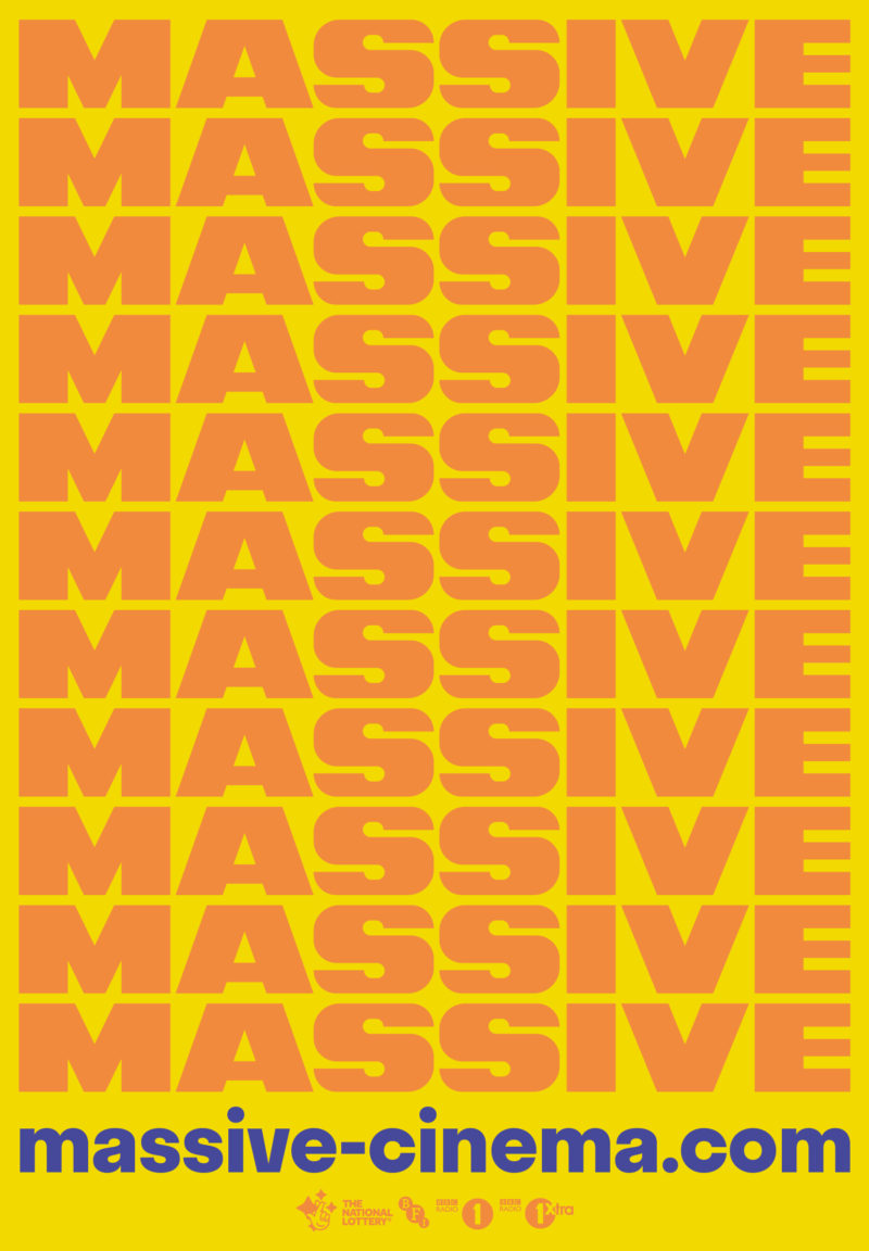
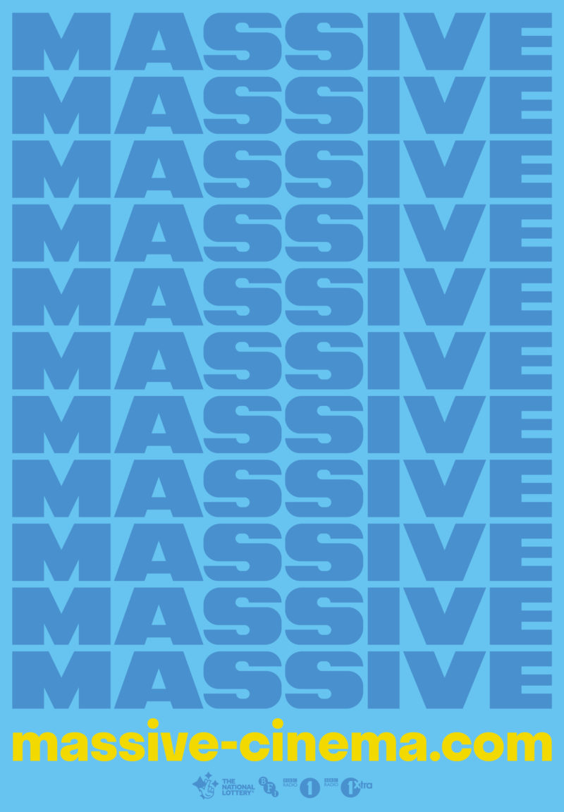
In collaboration with BBC Radio 1 and BBC 1Xtra, MASSIVE gives you a new way of watching the most hyped films of the year in the cinema with your friends before anyone else.
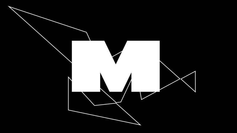
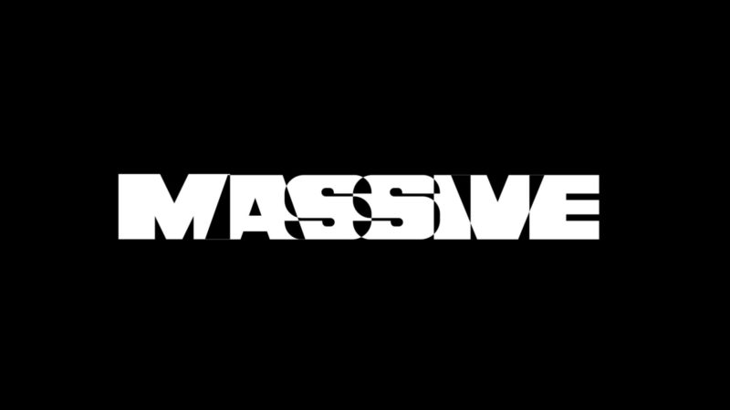
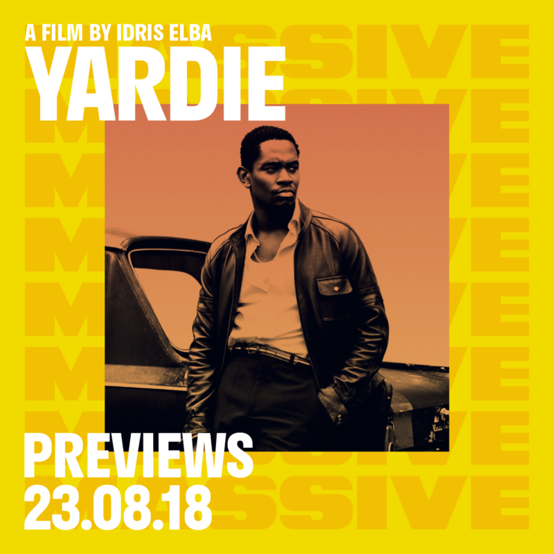

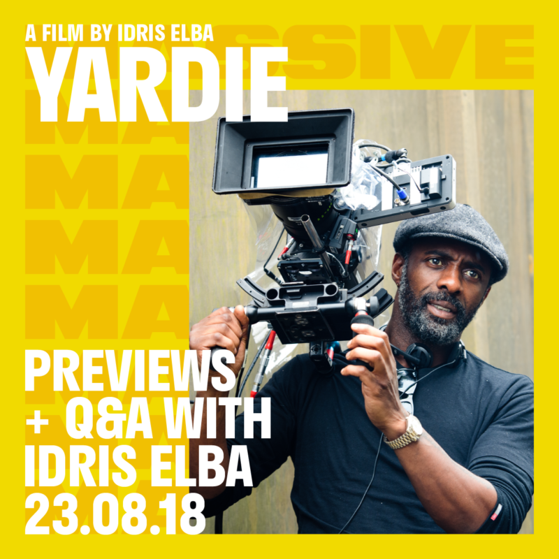
The name MASSIVE clearly had to be presented in a bold way – and as it was showcasing and framing film posters, we liked the idea of creating a masthead for the promotional material.
We wanted to create something simple but with a playful edge, making sure to include our work experience students and interns during the design development to ensure we had young people’s perspectives and input on the branding.
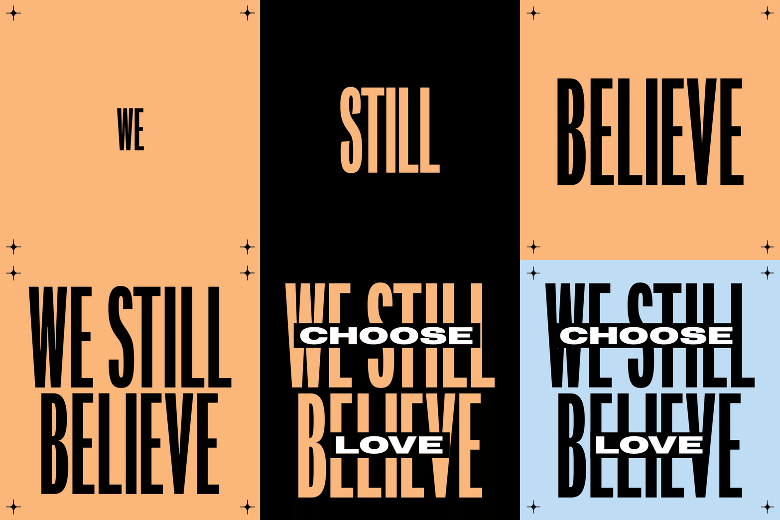
We wanted to achieve something that spoke to the audience in a clear and direct way without being patronising or decorative, not an emoji in sight either. We commissioned an exciting young producer called Aquarelle to create the sound design for the animated pieces, who we met through our work with Skepta’s Levis Music project.
Aries Moross
